
This Is Calligraphy with Life
The Strength and Spirit in Yu Geng’s Running Script

Ren Jingjing (任晶晶)
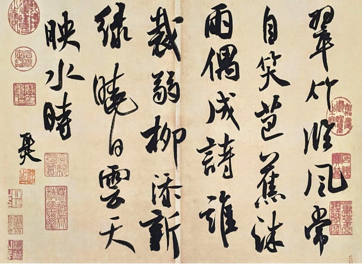
This work of running script is based on a self-composed poem: “Green bamboo faces the wind and often smiles to itself; plantain leaves, washed by rain, at times become poetry. Who has trimmed the tender willows and added new green? At dawn, sun, clouds, and sky are reflected in the water.” The artist is Yu Geng (郁耿), who signs himself “Erhuo” (耳火)—“ear” and “fire,” the two parts that make up the character Geng (耿). His Xiaohongshu social-media account is “Yugeng” (雨耕), and the inscription reads, “Composed and written by myself on the sixth day of the fourth month in the Bingwu year.” Online, there is a calligraphy artist named Yugeng (雨耕), introduced as Song Yanjun (宋砚君), born in Jilin in 1968, styled Zaogutang (凿古堂), with records in calligraphy, seal carving, and fine arts. Whether this is the same person is unknown.
What first strikes the viewer in this work is its force. The characters are large, the ink is heavy, and the movement of the lines opens wide. There is almost no cautious testing of the brush. This is not the manner of palace-style regularity, nor is it the neat, pretty calligraphy often seen in exhibition halls. It has a mountain-field air. There is wind in it, water in it, and also a little deliberate looseness. It is clear that the artist wants to write out the dampness, swaying, and movement of “bamboo,” “plantain,” “rain,” “willow,” and “clouded sky,” rather than merely copy the poem. This direction is right. Running script fears nothing more than becoming mere transcription and losing its breath. At least this piece has breath, movement, and a rush in the wrist.
Dense Ink Holds the Scene; the Overall Force Is Open and Broad
The ink in this work is generally heavy. Where it is black, it is very black, and it holds the whole picture down. Set against the antique-toned paper and red seals, the visual effect is strong. In a social-media screenshot, this sharp relation among black, white, and red easily catches the eye. Many viewers will find it “high-level,” and it is no surprise that comments praise it as being of “extremely high standard.” Its visual impact is indeed strong.
But from the standpoint of calligraphy itself, the ink could be handled with more care. Dense ink is not the problem. The problem is the range within the dense ink. The ink method of the Two Wangs (二王) does not win by heaviness, but by line quality and breath. Mi Fu (米芾), meanwhile, was highly skilled at using dry and wet, dense and pale ink. His dense areas are like mountain stone; his wet areas are like clouded vapor; his dry areas are like bamboo branches brushing across a wall. Ink is not a mass of black. It is a record of time.
This piece has some variation in ink, but not enough. The differences in density between many characters are not large, and the dry-wet contrast could be opened further. The poem contains images such as “facing the wind,” “washed by rain,” “tender willows,” “dawn sun,” “clouded sky,” and “water.” These images are very suitable for expression through ink method. Wind should be light. Rain should be moist. Willow should be soft. Dawn sunlight should be translucent. Water should have movement. At present, the overall ink is a little too strong. It lacks several places of true airiness. It has the motion of “wind,” but less of the moisture of “rain”; it has the bone of “bamboo,” but less of the emptiness of “water.”
If the artist wants to take this path higher, the ink must move from “black with force” toward “time between black and white.” In a work of running script, not every place can try to be the main character. There must be dense ink, pale ink, dry ink, and wet ink. Some characters must retreat, while others come forward. Only then can the whole work have distance, air, and the layered feeling of landscape.
The composition uses several vertical columns. The spacing between characters is relatively tight, the spacing between lines varies, and the overall arrangement is rather full. Its advantage is atmosphere. Each line has a downward weight and a side-to-side sway. The many red seals give the work an antique flavor and a sense of collection. From a distance, it does look like a complete calligraphy-and-painting-style piece.
Still, there are two problems in the composition. One is that the rhythm between the lines is not yet distinct enough. Some lines are heavy, and other lines are also heavy. Each seems eager to rush forward. A good composition should be like a meal: there should be a main dish, side dishes, hot soup, and something refreshing. Not every plate should be loaded with chili. In this work, the main strokes in several lines are very strong, which makes the visual field somewhat crowded. This is especially true in the middle section, where thick strokes, heavy ink, and long verticals gather together, leaving too little room to breathe.
The other problem is that there are slightly too many seals. In calligraphy, seals are not decorative stickers. They should anchor corners, fill space, regulate the energy, and also know when not to appear again. In the screenshot, the seals on the left and right sides are fairly dense. The red certainly adds antique feeling, but it also competes with the characters. If the original work is large, the effect may be better than it appears on a phone screenshot. But from the image, the liveliness of the seals has already gone a little beyond what is needed. In calligraphy, one must beware of turning “literary spirit” into “antique flavor.” Too many seals can make a work seem as if it is trying to prove how traditional it is. Real tradition is not piled up with seals.
There is one further pity in the composition. The poem is fresh and light, but the overall atmosphere is rather heavy. The poem writes of green bamboo, plantain, tender willow, dawn sun, and water light. It has the mood of a light southern scene. The characters, however, are written in a more northern manner—strong, heavy, and full of force. These two things are not impossible to combine, but they need better adjustment. If certain lines were made looser, and if “tender willow,” “dawn sun,” and “water time” were written more lightly, the poem and the calligraphy could illuminate each other. At present, the characters press down on the poem, and force presses down on mood.
Yet this is also where the problems begin. The work has energy, but it is not yet deep enough. It has force, but in some places the direction is too straight. It has Mi Fu’s (米芾) brush-sweeping quality, but it has not fully held on to the inner discipline of the Two Wangs (二王). It is like a person walking a mountain path with long strides and raised sleeves, while the feet have not yet stepped firmly everywhere. From afar, there is spirit in the wind. Up close, one sees rough edges. These rough edges are not the rough edges of the paper. They are rough edges in discipline.
From the Two Wangs, It Gains Flow; from Mi Fu, It Gains Sweeping Force
The character structure in this piece clearly does not follow a straight and proper path. The artist deliberately lengthens, flattens, tilts, and staggers the characters, giving each one a kind of posture. In characters such as “cui” (翠), “zhu” (竹), “lin” (临), “feng” (风), and “chang” (常), the vertical force is strong and presses the picture downward. In “zi xiao” (自笑), “ba jiao” (芭蕉), and “mu yu” (沐雨), the character forms have a swaying quality that matches the poem. This treatment shows that the artist is not merely copying models, but has a pictorial awareness of his own.
Its advantage is that it is not stiff. Much contemporary running script looks like people standing in line: every character is upright, every stroke is explained clearly, but there is no life. This work is not like that. It knows that running script needs sideward force, yielding and avoidance, and changes in size. The characters are not isolated from each other. A current of energy pulls them along.
But the greatest weakness in the character structure also lies in this “posture.” In order to seek tilt and movement, some characters become loose. In characters such as “cui” (翠), “chang” (常), “shui” (誰), “ruo” (弱), “liu” (柳), and “xin” (新), the local center of gravity sometimes leans too far, and the inner support among the strokes is not enough. Good tilting does not mean writing a character crooked. The brilliance of Wang Xizhi’s (王羲之) line lies precisely in this: the character may seem slanted, but inside it there is an invisible central axis. Mi Fu (米芾) made his characters sway even more, but they sway with bone, like a boat moving on water while its keel remains in place.
In some places, this work is more like bamboo blown open by wind, with the joints not fully connected. This is especially true in some characters with upper-and-lower structures. The response between the upper and lower parts is not tight enough. The character has outer movement, but its inner organization is somewhat loose. As a result, it looks satisfying from afar, but up close one feels that certain characters have not quite “stood up.”
The character structure could still be drawn further inward. Running script may open outward, but before opening, it must know how to gather itself. A character must have posture, but it also needs a pelvis, shoulders, and a waist. It cannot merely let the outer form swing while allowing the inner sinews and bones to loosen. The brushwork of this piece shows two sources. One is the running-script line of the Two Wangs (二王), which stresses continuity, responsive linkage, and the hidden communication between strokes. The other is the “brushing” quality of Mi Fu’s (米芾) line, which stresses speed, side-brush, dramatic movement, and the tension between ink mass and flying white.
The artist clearly prefers Mi Fu (米芾). Many vertical strokes and long left-falling strokes are written with great pleasure, and once the brush goes down, there is little hesitation. In characters such as “lin” (临), “feng” (风), “mu” (沐), “tian” (添), and “xiao” (晓), there is a sense of the brush sweeping past. It does not wind around, it does not grind, and it does not polish the strokes too smoothly. This is an obvious strength. If running script has no speed, it easily becomes false running script slowly traced out. At least this piece is not traced.
But the hardest part of learning Mi Fu (米芾) is precisely not speed. It is control within speed. Mi Fu’s (米芾) brush is not a broom sweeping the floor. His brush turns, presses, lifts, and pauses on the paper with great clarity. It may look like a single sweep, but the changes in the brush face are numerous. The thick parts are not clumsy, the thin parts do not break, the turns do not collapse, and the endings are not empty. The problem in this work is that in some places it has acquired Mi Fu’s (米芾) outward movement, but has not fully digested Mi Fu’s (米芾) inner elasticity.
For instance, at several turning points, the strokes tend to press straight through, lacking the rounded vitality of “turning within the break.” The beginnings of some horizontal and vertical strokes are also somewhat similar. They begin with strength, but not enough variation. Good running-script brushwork cannot be only forceful. It needs lightness, heaviness, pause, movement, and places that seem broken yet are not broken. The Two Wangs (二王) are especially strong in this. Wang Xizhi’s (王羲之) brilliance often lies in the smallest details: one stroke has just landed, and the next already has energy; one stroke seems broken, yet within the character the breath remains connected.
This work has energy in its large lines, but the small joints are not yet fine enough. It is like a martial artist whose fists and feet have strength, but whose finger techniques are still a little rough. Running script most fears roughness. Roughness is not boldness. Boldness is when one has law and no longer displays it. Roughness is when one has not yet controlled the brush and has already let it go.
The relation between this running script and the Two Wangs (二王) lies not in exact outward resemblance, but in the basic idea of line movement and responsive linkage. The running script of the Two Wangs (二王) stresses natural flow, the breath between strokes, and continuity inside and outside the character. This piece by Yugeng (雨耕) clearly understands that running script cannot let each character stand alone, so the brush force runs through the lines and creates traction between characters. This is where it rises above ordinary “street” calligraphy.
But the core of the Two Wangs (二王) is not “connection.” It is “elegance.” This elegance is not weakness, nor prettiness, but proportion. Wang Xizhi’s (王羲之) lines, however open, do not lose clarity; however slanted, do not lose uprightness; however fast, do not lose restraint. Yugeng’s (雨耕) characters have the flow of the Two Wangs (二王), but not yet enough of their clarity. The emotion is more exposed, the force more forward, and the restraint insufficient. In other words, it has the speed of running script, but it still needs more inward reserve.
Mi Fu’s (米芾) influence is more obvious. Mi Fu (米芾) was skilled at side-brush, tilted character force, leaping lines, and the creation of risk. In this work by Yugeng (雨耕), the long lines, thick-thin changes, and swaying between columns all show the shadow of Mi Fu (米芾). In particular, the pleasure of the brush “sweeping down” comes close to the temptation Mi Fu (米芾) leaves to contemporary calligraphers.
Yet Mi Fu (米芾) is not easy to learn. If one learns him shallowly, the result becomes mere wobbling. If one overdoes him, it becomes frenzy. If one learns only the expression, it easily becomes performance. The strength of this work by Yugeng (雨耕) is that it dares to write, dares to make the characters large, and dares to let the strokes rush out. Its weakness is that in some places it has not fully turned “risk” into “stability.” Mi Fu’s (米芾) risk is risk with rescue. Some of the risk in this work has not been fully brought back.
This Is Calligraphy with Life
What deserves the most praise in this work is its courage. The artist is not afraid to write large, not afraid to use heavy ink, not afraid to tilt the character force, and not afraid to reveal emotion in the work. If calligraphy has no courage and only technique, it soon dies. Yugeng’s (雨耕) characters have no dead air. They are like bamboo leaves in the wind. Some branches may be disorderly, but they are moving.
Another strength is the sense of immediacy. Many works of calligraphy look as if they were arranged after the fact—too clean, too safe. Yu Geng’s (郁耿) characters have the feel of improvisation. When he writes “facing the wind,” there really is wind in the characters. When he writes “washed by rain,” although the moisture is not enough, there is still a rain-soaked sway. When he writes “tender willow,” the brush force indeed has the posture of tender willow. When he writes “dawn sun, clouded sky,” there is also a movement opening outward. The work and the poem are not completely cut off from each other.
There is also personal temperament in it. Calligraphy most fears having no temperament. Without temperament, even the most orderly characters are only copybook exercises. Yugeng’s (雨耕) characters are a little stubborn, a little loose, and a little unwilling to be tied down by rules. If this energy is joined to discipline, it can become a presence. If it is simply allowed to run on, it can also become a fault.
Placed in today’s calligraphy environment, this work has one clear advantage: it is not boring. In much contemporary running script, the problem is not that it is wrong, but that it has no force. The characters are orderly and the lines smooth, but after looking at them one remembers nothing. They are like clean meeting minutes: without illness, but also without life. At least this work by Yugeng (雨耕) has life. It has ideas, tension, speed, and a little unruly energy.
This is more valuable than much “exhibition-style” running script. Exhibition-style calligraphy often pursues large formats, large ink masses, and large compositions. It is visually strong, but it easily becomes formulaic. This work by Yugeng (雨耕) also carries that risk, but it still preserves a personal touch. It is not completely laid out according to a formula. There is a sense of the moment in the characters. One can see the artist’s interest as he writes.
Compared with some academy-trained calligraphers, its shortcomings are also clear. The strength of the academy lies in careful training, stable line quality, clear sources in character structure, and precise compositional calculation. This work by Yugeng (雨耕) has more wild energy than academy calligraphy, but it lacks precision. At times the line moves too fast, the structure opens too early, and the ink layers are not durable enough. It catches the eye at once, but may not withstand long, close looking. Truly high calligraphy should have force from afar, law up close, and taste over time. This work by Yugeng (雨耕) already has part of the first two, but “taste over time” still needs to be refined.
Compared with folk calligraphy, it stands much higher. The common problem in folk calligraphy is that it speaks only of force, not of source; only of pleasure, not of discipline. At least this work by Yugeng (雨耕) is not written at random. Behind it are traces of the model-letter tradition and traces of Mi Fu’s (米芾) training. Its problem is not that it has no tradition. It is that the tradition still needs to sink deeper. At present, it is a little like having taken a sip of both the Two Wangs (二王) and Mi Fu (米芾), without yet turning them fully into its own blood. This running script by Yu Geng (郁耿) is not a mediocre work. It has courage, energy, a personal face, and the shadows of the Two Wangs (二王) and Mi Fu (米芾). Its strength is that it is not stiff, not vulgar, and does not turn calligraphy into a craft object. It dares to let brush and ink enter emotion. That is rare.
But it has not yet reached true ease. At times it is too eager to show strength, too eager to create posture, and too eager to make people feel at first sight that it is “high-level.” The high place of calligraphy is often not in making viewers applaud at once, but in making them quiet after looking for a long time. That kind of quiet is harder than applause.
What this work must most guard against is the sense of “exertion.” The problem is not that the force is too great, but that if force is displayed everywhere, the work loses aftertaste. In high calligraphy, the artist often does not put all the strength on display. Instead, one feels that there is strength inside, but it has not all been spoken.
If this work is to improve further, it needs less outward display and more inward containment. In particular, some long verticals, thick strokes, and heavy ink should be more restrained. The places that need weight should be heavy, and the places that need lightness must be light. At present, some areas sound as if they are speaking loudly all the way through. The atmosphere is there, but the ear grows tired. Running script is not shouted out. It should speak like a person, with high and low tones, pauses, and moments of wanting to speak but stopping short.
In character structure, the “central palace” should also receive more attention. Many characters have posture on the outside, but the middle is somewhat loose. If the center is loose, the character will not stand up to looking. The artist could return more often to the Preface to the Sacred Teaching, in Characters Collected from Wang Xizhi (《集王圣教序》) and the Preface to the Orchid Pavilion (《兰亭序》), and retrain the inner relations of the characters. He should not only learn the floating grace of the Wang style, but also its gathering force. He should not only learn Mi Fu’s (米芾) tilt, but also Mi Fu’s (米芾) turning of the brush and rescue from danger.
In ink method, he should practice dry and wet more deeply. He could use less of the uniformly dense black and attempt more changes within a single stroke. When writing bamboo, the brush can be a little drier. When writing rain, a little wetter. When writing willow, a little softer. When writing dawn sun, a little more translucent. The poem contains so many natural images that the ink cannot give only one kind of weather.
In composition, he should dare to leave more blank space. At present, the picture is rather full and the seals are lively. If some seals were reduced and the breathing space between lines enlarged, the work might instead feel more refined. Real antique spirit does not come from many seals. It comes from quietness on the paper. After the characters are written, the blank spaces must also be able to speak.
If Yu Geng (郁耿) continues along this path, three directions matter most. One is to return to the Two Wangs (二王) and practice “cleanliness.” Here, cleanliness does not mean making the characters pretty. It means removing the mixed and scattered air inside the lines. Each stroke should begin clearly, move naturally, and end with something left over. Short lines and small turns especially need practice. Large strokes easily create effect; small strokes reveal real skill.
The second is to reread Mi Fu (米芾) and practice “control.” Mi Fu (米芾) is not disorderly movement, nor deliberate tilting. The strongest thing in his writing is his ability to turn imbalance into balance and danger into pleasure. If Yugeng (雨耕) wants to learn from Mi Fu (米芾), he cannot learn only the sweeping force. He must learn the shifts of lifting and pressing, the changes of brush face, and the recovery of character force. What goes out must also be brought back.
The third is to reduce decoration and increase emptiness. The seals can be fewer. The line spacing can be looser. The ink can have more layers. Let the poem come out, and let air come in. At present, this work has mountain wind, but the window is not open enough. It has rain feeling, but the vapor has not fully spread.
In the end, what truly needs improvement may not be a single stroke, but a state of mind: less desire to finish the work quickly, and more patience to let brush and ink grow by themselves. Bamboo facing the wind does not need every leaf to make a loud sound. Plantain leaves washed by rain do not need every drop to fall on the paper. Good running script, in the end, does not fill the page with wind and rain. It lets the viewer see that after the wind and rain have passed, there is still a little coolness left on the paper.