
The Anticipated “Dengke Style”
An Analysis of Yang Dengke’s Calligraphy

By Ren Jingjing
【Editor's Note: Yang Dengke’s (杨登科)scroll is a noteworthy achievement—rooted in tradition but not entangled by it. The brushwork is bold and fluid; the layout precise and organic. As the ancients said, “The life of calligraphy lies in its spirit,” and this piece exudes that living breath. Still, perfection lies ahead: further refinement in structure, pacing, and tonal modulation could elevate Yang’s work from distinguished to definitive. Through patient study and creative daring, he may yet fuse lineage and invention into a unique visual language—the long-awaited emergence of what might truly be called the Dengke Style.】
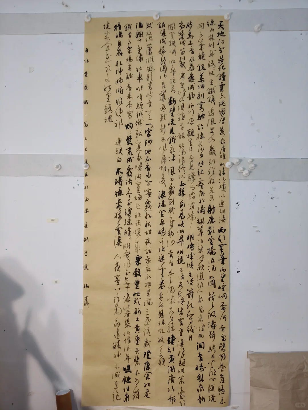
Yang Dengke’s latest scroll of semi-cursive script (行草) unfolds as a vertical composition rendered in ink on paper, where tonal variations of black sweep across the surface in one continuous breath. At first glance, the lines slither with energy, animated and serpentine. Closer examination reveals a rich interplay of structure and rhythm—uneven in formation yet looped in measured order—suggesting both antiquity and a personal idiom in evolution. In this essay, I will analyze Yang’s technique from several angles—brushwork, character structure, compositional logic, stylistic influences—and propose areas for refinement.
Brushwork: Strength Tempered with Grace
Centered Strokes
Most strokes are anchored in centered brushwork, with even pressure from start to finish. This results in consistent line width and a rich saturation of ink. Characters such as heaven (天), earth (地), bell (钟), and chamber (室) display solid, deliberate strokes, undergirded by a powerful central axis.Side-Flicked Turns
At points of inflection or redirection, Yang often deploys the brush at an angle, creating a knife-like sharpness. These oblique strokes lend the work a tactile vigor—a fusion of steel-like rigidity and the elegance of iron filigree.Lifting and Pressing
The scroll is full of rhythmic modulations. Brush pressure fluctuates to create contrast: light flicks mark the beginnings of strokes; deep presses gather ink, producing emphatic horizontals and verticals. Between dots and lines, transitions range from smooth to abrupt, from flowing like drifting clouds to dense and weighty—imbuing the text with musical phrasing.Tonal Variation
The visual field is animated by stark contrasts in ink density. Swaths of heavy black, as in bell (钟) and iron (铁), command attention with monumental force, while diluted strokes—like those forming return (归) or light (光)—hover like echoes, introducing spatial depth through the interplay of opacity and transparency.
Character Structure: A Balance of Solidity and Motion
Geometry of Form
Many characters lean toward flattened, horizontal compositions, with rounded edges and steady execution, projecting fullness. Others, such as bell and iron, break from this roundness with sharper, angular tension, evoking a hardened, steely force.Shifting Centers of Gravity
Characters like heaven and revival (复兴) have heavier top portions, creating an elevated visual center, while others like bell chamber (钟室) and cosmos (乾坤) maintain central balance with well-grounded symmetry.Internal Coherence
Some characters exhibit a tight interplay between stretched and compressed components—radiance (光辉), illumination (照耀)—which achieves a strong internal cohesion. Yet a handful suffer from overcrowding, where competing strokes diminish structural clarity.Variations in Scale and Weight
Letterforms shift in size and weight, establishing a dynamic visual rhythm. Strategic use of space and proportion prevents monotony, creating a living pulse across the scroll.
Composition: The Scroll as a Breath in Motion
Continuity of Line Energy
Yang’s scroll breathes like a body in motion. Lines flow unbroken across the paper; spacing fluctuates from dense to sparse, mimicking the inhale-exhale cadence of natural breath. The eye glides through the work, rarely interrupted.Articulated Segments
The scroll opens with brisk, expansive gestures—an energetic overture. The middle segment softens, the ink tones more nuanced, before tapering into a final section of quiet restraint. The tripartite structure follows a classical model of introduction, elaboration, and closure.Use of Negative Space
Margins—top, bottom, and flanks—are reserved with care. These blank intervals offset the textual density, creating contrast and offering the viewer moments of visual rest. The placement of blank space may seem spontaneous but is tactically deployed.Vertical Depth
The scroll’s considerable length demands vertical scanning. Yang varies spacing and ink density across strata, adding layers of movement and compositional modulation, much like a scroll painting of rivers and mountains.
Stylistic Character: Classical Resonance, Individual Voice
Lineage and Echoes
One detects in Yang’s work traces of ancient masters—Yan Zhenqing’s (颜真卿) solid uprightness, Huai Su’s (怀素) wild cursive flourishes, and Mi Fu’s (米芾) airy feibai (“flying white”) technique. In structure, one finds the gravitas of Yan; in motion, the unshackled spirit of Huai; and in texture, the dry-brush mystery of Mi.Personal Inflection
Rather than imitate, Yang adapts. His brushwork toggles between strength and levity, his ink playfully generous then suddenly austere. He balances muscular tension with lyrical drift, producing a tone that is elegant, almost meditative.Vibrancy of Energy
The scroll thrums with vitality—an unceasing rhythm that surges and retreats like surf. Its ebb and flow reveal not only spontaneity but a disciplined understanding of tempo and phrasing.
Heritage and Innovation: A Dialogue Across Time
Tradition Inherited
A fusion of Yan’s sinewy bones and Liu’s elegant structure (“颜筋柳骨”) gives the scroll its architectural frame.
Mi Fu’s “flying white” technique adds dynamic texture, where dry brush skips across the surface, creating optical breathing spaces.
Innovative Synthesis
Yang refuses confinement to any one model. He assimilates multiple influences and, through careful refinement, arrives at a style that bears historical depth without succumbing to imitation. The result is a calligraphy that feels rooted yet contemporary.
Points of Distinction
Line Strength
Strokes are robust and deliberate. The pressure is palpable. Folded angles slice clearly, creating crisp visual punctuation.Rhythmic Design
Yang’s layout breathes in measured cadence. The eye is compelled to follow, drawn by visual beats and pauses.Contrast of Form and Void
Dark and light, wet and dry—these oppositions are pronounced, lending the scroll a chiaroscuro of ink.Unified Spirit
The scroll coheres in spirit. The brush never falters, the energy never flags. There is a throughline of intent, a current pulling all parts forward.
Flaws and Shortcomings
Occasional Structural Weakness
In striving for expressive brushwork, some characters become structurally unbalanced. Revival and bell chamber, for instance, suffer from overcrowding and lack a centered anchor.Midsection Instability
Certain passages in the middle section contract too tightly. The sudden compression jars the otherwise smooth pacing.Overuse of Heavy Ink
Some strokes are weighed down by excessive saturation, creating blocky densities that resist visual flow. Strategic lightening or white space could relieve these congested zones.Inconsistencies in Brush Modulation
Transitions between diluted and saturated ink are at times abrupt. Softer connecting strokes or buffer zones might ease the shifts and enhance cohesion.
Suggestions for Refinement: The Path of Mastery
Focused Structural Study
Characters prone to imbalance should be repeatedly practiced from classical models. Emphasis should be placed on maintaining internal gravity and calibrating stroke placement.Compositional Sketching
Small-scale studies replicating scroll dimensions can help the artist test variations in spacing, pacing, and ink tone. Lessons drawn here can then scale up into fuller works.Ink Transition Mastery
Practice with wet-dry alternation should emphasize subtle gradation. Inserting lighter strokes near heavy passages can offer smoother transitions and visual relief.Peer Review and Self-Examination
Exhibitions and feedback sessions can reveal blind spots. Documenting and enlarging sections of the scroll enables micro-level critique of stroke order and ink dispersion.Holistic Fusion
Over time, Yang may experiment with fusions—adding clerical script (隶书) textures to cursive gestures, or invoking the archaic restraint of early manuscript styles. Such integrations could extend the expressive reach of his evolving voice.