
Text Needs Clarity, Calligraphy Needs Breath
—On Fan Zeng’s Handwritten “Statement Concerning Fan Zeng”

Ren Jingjing
文本需要清楚,书法需要呼吸——评范曾《关于范曾的声明》手书
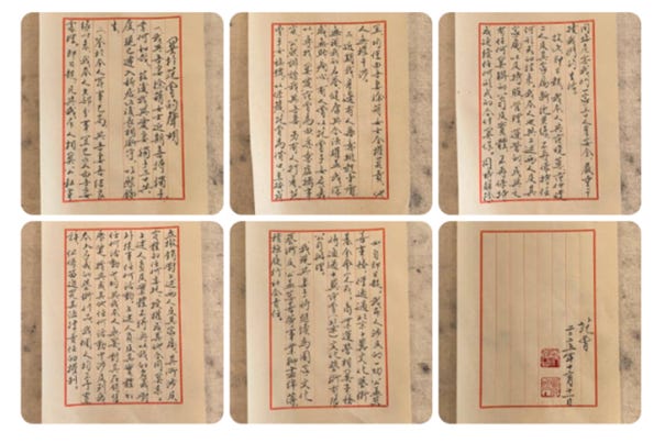
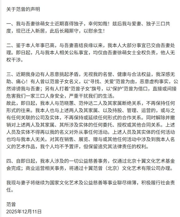
Titled “Statement Concerning Fan Zeng” (《关于范曾的声明》), the text is divided into four sections. It begins with a brief account of family matters, moves on to arrangements of authorization, then draws a hard line between the author and certain people and institutions, and finally specifies the channels through which charitable and commercial affairs will be handled. It is dated “December 11, 2025” (2025年12月11日). To write a public statement in running script and then publish it is to ask readers to take in both the “matter” and the “hand.” The pairing is tense by nature: a statement is meant to define boundaries, while calligraphy is meant to release a certain breath; a statement asks to be checked, while calligraphy asks to be revisited. When two aims share one sheet of paper, success depends not only on brushwork but also on whether the language can stand on its own, whether the form is coherent, and whether the layout leaves room for the movement of qi—the living current that carries the writing along.

Statement as Writing: A Half-Classical, Half-Modern Voice That Switches Too Fast (声明书写:半文半白,切换太急)
A statement is written, first of all, for the public. It does not need ornament, but it does need steadiness. That steadiness rests on two things: a unified register of language, and a sequence of ideas that advances without snagging. A title like “Statement Concerning Fan Zeng” (《关于范曾的声明》) is common in Chinese public notices. Its function is straightforward: it names the subject at once, so the reader immediately knows who the statement is about. In terms of convention, it is not ungrammatical, and it does not violate the habits of official writing—but it also clamps down on the first breath. And the problem is tied to that same convention: the title sounds like a template. A template title steers the tone straight into the lane of legal paperwork or public-relations copy. If what follows stays in the same firm, plainspoken mode, the choice holds. But this text quickly turns toward lyric emphasis and classical exclamation. The title’s bureaucratic timbre then becomes the first crack: it opens hard, then asks to soften at once. The reader’s ear has to shift gears.
In calligraphy, a title carries an extra burden. It is the face of the whole piece. Once that face is made of a template sentence, the work’s literary air—its wenqi—gets boxed in from the start. A writer may choose, deliberately, to bring documentary language into calligraphy, but that choice demands even more cleanliness in the sentences and even more clarity in rhythm. Otherwise the result is an uneasy blend: it looks like an announcement on the outside, and reads like a congratulatory toast on the inside.
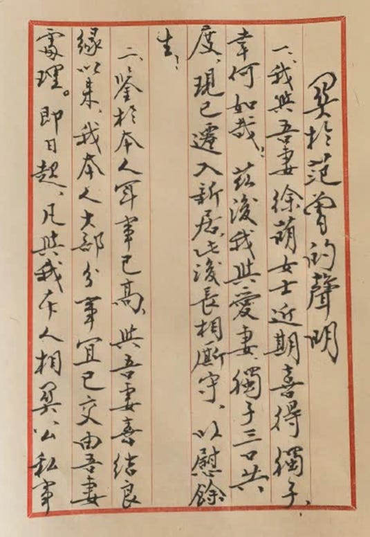
The first section of the statement includes the sentence: “I and my wife, Ms. Xu Meng (徐萌女士), have recently been blessed with a son—how fortunate we are! Henceforth, my beloved wife, our son, and I, the three of us, will…” (“我与吾妻徐萌女士近期喜得独子,幸何如哉!兹后我与爱妻、独子三口共度……” ). These lines are intelligible, and they contain no obvious grammatical break. The trouble is that the register changes too quickly—and it changes without needing to. “I and my wife” (“我与吾妻”) is the most conspicuous splice in a single phrase: the first half uses modern vernacular (“我与”), while the second half slips into classical diction (“吾妻”). This is not absolutely impermissible, but it makes the reader feel the speaker’s posture shifting: one moment it sounds like a public notice, the next like classical prose. A smoother approach usually commits to one side. If it is modern, it should remain modern—“my wife, Ms. Xu Meng, and I…” If it is classical, it should remain classical—“I, together with my wife…” in a consistently classical frame. But once one chooses a fully classical mode, the language cannot easily return to hard modern terms like “authorization,” “management,” and “operations,” unless the entire piece adopts the idiom of classical official documents. As it stands, the line reads like two outfits forced onto one body. Whether one writes a statement or an official document, the register should not be allowed to tangle. Half-classical, half-modern is not a taboo, but it must carry one unified voice. A splice like “我与吾妻” is the quickest way to pull a reader out of the text. Once the reader is pulled out, the breath of the passage disperses.
“Henceforth” (“兹后”) is an old connective typical of formal contracts and letters. Set beside the domestic news of “being blessed with a son,” it lands as stiff. In ordinary modern Chinese, “from now on” would do. The purpose of a statement is to be understood, not to make the reader feel that the writing is deliberately archaic. “How fortunate we are” (“幸何如哉”) is a classical exclamation: full of emotion, almost theatrical. On its own it is not a mistake. But it is followed immediately by clause-like information about authorizations, severing ties, and assigning responsibility. The breath of the paragraph is therefore forced into a hard splice: the first half reads like celebration, the second half like legal boundary-setting. The reader senses a mismatch—one voice announces joy, another draws lines, and the two are crowded into the same space. This is neither classical prose nor plain modern writing. It is modern official language with a few classical flourishes inserted. In a spoken toast, such phrasing might pass smoothly. In a public statement, the posture becomes unstable.
In the second section, the phrase “I myself” (“我本人”) appears in repeated form: “I myself am advanced in years… most of my affairs have been entrusted to my wife… all public and private matters related to me myself…” (“我本人年事已高……我本人之大部分事宜已交由吾妻处理……凡与我本人相关公私事宜……” ). “I myself” does not violate Chinese grammar. It is often used to emphasize “personally,” or “not spoken on my behalf by others.” In cases where impersonation or unauthorized posting is a real risk, such emphasis can be useful. But words like “I myself,” “henceforth,” and “effective immediately” should be used sparingly. Piled up, they read like PR copy rather than a work meant to be looked at. A statement does need authority—but authority should not be built by stacking hard, legalistic terms. Authority comes from clarity, not repetition.
Here the problem has two layers. The first is redundancy. “I” already names the subject. Repeating “I myself” makes the sentence heavier. In a statement, it can appear once, at the point where responsibility is assigned, and that is enough. When it recurs, the reader feels the writing straining. The second layer is a clash of registers. Earlier the text uses a lyrical classical exclamation like “幸何如哉,” while later it turns to the hard, legal emphasis of “我本人.” These do not belong to the same current of voice. If the aim is lyric warmth, the sentence needs elasticity. If the aim is legal firmness, the sentence should shed emotional color. To press both into one short space is to tear the language.
The third section uses strong emotional terms like “helpless” and “heartbroken” (“无助、痛心”), while also listing acts of severance—“cutting off relations,” “revoking authorization,” “no longer maintaining any cooperative relationship,” and “reserving the right to pursue legal liability” (“断绝关系”“撤销授权”“不再保持合作关系”“保留追究其法律责任的权利”). None of these elements is, in itself, forbidden in a statement. But packed into a single paragraph, they make the reader feel as if the volume is being held at a constant peak. Emotional language raises the pitch; clause-like legal language hardens the tone. When the two are layered together, fatigue sets in.
There is also the matter of density. The third section compresses names, identities, slogans, companies and entities, delegations of authority, severance of responsibility, and the scope of works involved. One can write a statement this way, but then the sentences must be short and the layers must be cleanly separated. As written, it reads as if a legal opinion has been transferred directly into a public-facing text: the reader can follow it, but does so out of breath.
Even the method of advancing the argument reflects official habits: frequent use of connectors like “effective immediately,” “therefore,” and “at the same time” (“即日起”“故此”“同时”) pushes the paragraph forward in clause-like steps. That works in announcements. But this text also wants to retain lyric emphasis and classical flavor. With two methods of propulsion competing, the breath keeps getting caught: just as the reader begins to move with the emotion, the clauses pull the reader back into legal language.
The conclusion, then, is limited but clear. As an announcement, the text is barely usable; as a calligraphic text, it is not sufficiently considered. Calligraphy needs wenqi, and wenqi comes from a unified register, from rhythm with alternations of tightness and looseness, and from sentences that can breathe. Here the pattern is the reverse: mixed register, tight rhythm, hardened sentences. The choice of text should align with the purpose of writing. If it is a statement, it should not be written in the breath of a lyric toast. If it is to be displayed as a work, it should not rely on a purely templated official style. If it wants to be both, then both language and brushwork must be more restrained. As it stands, the mixed register of the text meets an emphatic calligraphic posture, and the result is emphasis piled upon emphasis. The viewer feels pressed, not carried along.
Running Script as a Work: Structure, Brushwork, Ink, Layout (行书作品:结体、用笔、用墨、章法)
Structure: Expansive Outward Force, Big Characters That Read Well, but an Unsteady Core (结体:外拓取势,字大好看,但中宫不够稳)
The characters are relatively large, and the structure takes an outward-expanding stance. Many long strokes are pulled open, giving the writing a spread, staged look that catches the eye from a distance. In an exhibition space, viewers often take in the overall force before they notice the finer details. The advantage of this structure is immediate presence.
But once outward expansion goes too far, it produces a familiar problem: a large outer frame with an empty interior. When the core of the character—the internal center of gravity—is not firmly set, the writing begins to loosen. Running script fears looseness more than anything. It relies on the movement of qi and on continuous linking. When characters loosen, linking turns into mere adjacency—characters simply sitting next to characters—and the breath cannot travel. In close view, many characters lean outward in their center of gravity. They may be stable in a basic sense, but they do not tighten. And without that tightening, the writing offers little aftertaste.
Brushwork: Strength and Speed Are Present, Turns Are Hard, the “Sinew” Is Not Fine Enough (用笔:力度和速度都在,转折偏硬,筋骨不够细)
In stroke form, this piece emphasizes two things: pressing down with weight, and moving fast. Many starts and finishes show clear pressure, giving the lines thickness. The motion of the brush has a sliding quality, suggesting a pursuit of fluency and speed. The benefit is obvious: the writing looks decisive, forceful, and outwardly confident. A statement, which aims for legibility and a sense of position, can readily match this harder brush posture.
The drawback is also plain. Turns often pivot abruptly; roundness is limited; the lines feel hard. Running script can be hard, but hardness needs sinew, not brute force. Sinew comes from subtle shifts of lifting and pressing, from controlled release at turns, and from fine gradations between heavy and light. If those changes do not appear at turning points, the line becomes a quick run with nearly uniform thickness. Over time, that uniformity becomes monotonous.
Ink: Dense and Dark—Steady, but Lacking Layers (用墨:墨色偏实,稳是稳,但层次少)
In close view, the ink is consistently dark and full; there is little variation in dryness and wetness, thickness and lightness, or the broken whites of flying ink. Such inking has two effects. On the positive side, it is steady, heavy, and easy to read from a distance—well-suited to a statement that needs to be legible. On the negative side, it offers few layers. Exhibition running script often uses ink variation to set rhythm: one line slightly heavier, another slightly lighter; certain characters slightly drier, others slightly wetter. Here the ink feels as if it was kept at one level throughout, and so the visual rhythm flattens.
Layout: Ruled Grids and a Red Border Create a “Document Feel,” and They Also Lock the Breath (章法:栏格和红框带来“文书感”,也把行气锁住了)
The piece uses ruled paper with a red border. The vertical columns are fairly regular, like a fair copy. Spacing between characters and lines is tight, and the overall density is high. All of this strengthens a “document feel”: neat, readable, and geared toward delivering information. For a statement, that fit is almost too perfect.
From an exhibition perspective, however, it also locks the breath of running script. The grid assigns each character a fixed space; the red border seals the whole surface. Under those constraints, it becomes difficult to build larger rhythms through alternations of density and openness. The work risks becoming uniform: each line resembles the next; each paragraph carries the same weight. The viewer ends up seeing “neatly arranged,” rather than “breath in motion.” The strength of running script does not come only from pressed ink and speed. It also comes from lifting and pressing, from light and heavy, from dense and sparse. Once breath emerges, strength no longer feels stifling.
This work’s most intriguing aspect is that it brings a real-world text into calligraphy. Its most exposed weakness is that it wants to do three things at once: to function as an announcement, to carry lyric feeling, and to stand as an exhibition work. The result is a language that does not fully unify, brushwork that does not fully layer, and a layout that locks the movement of qi.
To write a statement as calligraphy is not, by itself, the wrong road. What goes wrong is mixing two sets of rules without letting either set fully stand. One can write it as a true announcement, keeping the register clean and consistent; or one can write it as a true calligraphic text, cutting away clause-stacking and letting the sentence breathe. Both roads can work. The hardest road is the third: wanting a little of everything. It can look steady at first glance, but it is also the easiest way to show strain.
Works Cited
Fan, Zeng. “Guanyu Fan Zeng de Shengming” [“关于范曾的声明”]. Weibo post, 11 Dec. 2025.
thank you for understanding