


Dancing Ink in the Modern Jianghu
---Calligraphic Aesthetics and Artistic Inheritance in the Work of Heroine Mofei

Ren Jingjing
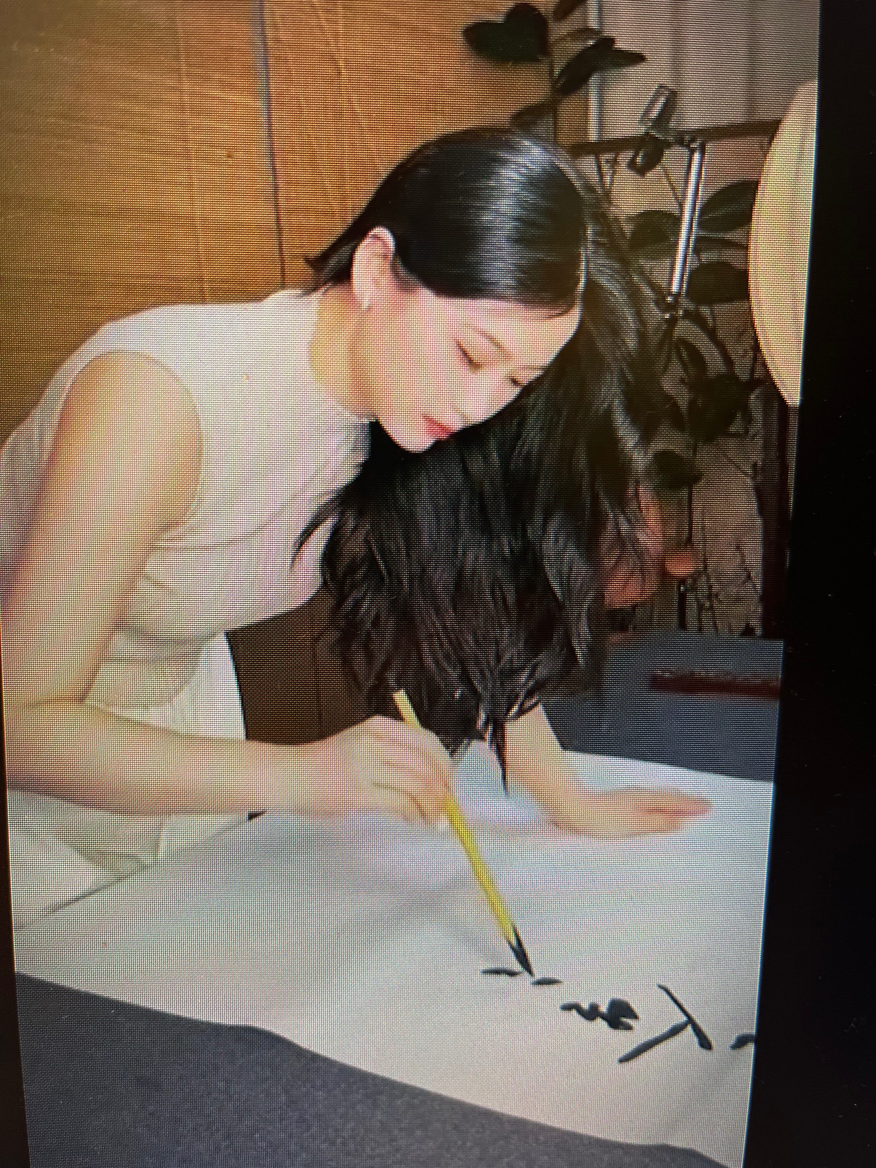
In a quiet wooden teahouse, sunlight falls through lattice walls onto a golden scroll inscribed with bold black characters. The hanging scroll’s calligraphy is arresting – sweeping ink strokes that at once echo centuries of tradition and the personal flair of its creator. This is the work of “Heroine Mofei” (女侠墨非), a young calligrapher who has gained attention on social media (notably Xiaohongshu) for blending old literati spirit with contemporary verve. In her videos, Mofei wields the brush as if wielding a sword, each stroke a deliberate flourish. Through three exemplary pieces – captured in images from her posts – we can translate and interpret her calligraphy, and explore the deep historical roots and aesthetic philosophies that inform her art. With an academic’s insight and a poet’s eye, we journey into Mofei’s world of ink, where running script (行书, xíngshū) and clerical script (隶书, lìshū) become vehicles of cultural memory and personal expression.
Huang Tingjian’s Legacy in Mofei’s Running Script
Mofei’s flowing xíngshū (running script) style – as exemplified in the first and third images – shows a clear debt to the tradition of Huang Tingjian (黄庭坚), one of the great Song dynasty master calligraphers. Running script is a semi-cursive form, blending structure with flow for readability and elegance, and Huang Tingjian was famed for infusing it with bold personality. In Mofei’s work, we observe the hallmarks of Huang’s influence. Huang Tingjian’s own style was often described as “tight in the middle, with strokes flaring outward”, each character featuring at least one exaggerated, elongated strokeCompare this to Mofei’s characters: in “相忘于江湖,” for instance, the central portions of characters remain compact, while long horizontals and slanting sweeps extend outward with jaunty confidence. This reflects what a scholarly analysis of Huang’s Songfengge letters noted: “the inner structure is constrained, yet strokes are stretched and released, with long horizontals and sweeping curves lending a dynamic rhythm”. Mofei channels Huang’s rhythmic contrast – some strokes press heavy and slow, others lift light and swift, creating an almost musical tempo across the phrase.
Another signature of Huang Tingjian’s running script is a bold, sinewy line quality. His brushwork was famously robust even in fine strokes, described as “瘦劲有力” – slender but powerful. In Mofei’s running script, we see slender strokes that never look weak; even a thin line exudes springy energy, tapering to a point without losing tension. Her control of the brush – pressing down for thick, ink-rich lines and lifting for whisper-thin trails – shows a pursuit of what Huang valued as “清气”“生动” – a pure, spirited vitality in writing. Mofei’s lines are not as wildly mannered as some of Huang’s most eccentric pieces (where he famously made characters dance at radical slants), but the kinetic spirit is present. For example, the character “尘” in “远离尘嚣” has a sweeping final hook that flicks upward spiritedly, much like Huang Tingjian might enliven an otherwise humble component. Her composition also echoes Huang’s preference for varying density: some characters are tightly bunched, others given more airy spacing, achieving what one might call the “dense and sparse” rhythm essential to classical aesthetics. This draws the eye similarly to Huang’s works, in which characters jostle in lively asymmetry yet the overall page remains balanced. Mofei’s running script inherits that paradoxical Song style blend of robust structure and free expression – a legacy of Huang Tingjian’s 尚意 (high esteem for artistic idea) approach, where the calligrapher’s personality and intention shine through even as they honor traditional forms. In this way, her work is a contemporary tribute to Huang’s influence: she “learns from the ancient without being mired in it, establishing a style at once disciplined and liberally creative,” much as Huang himself was praised for “studying the old masters but not imitating them slavishly”.
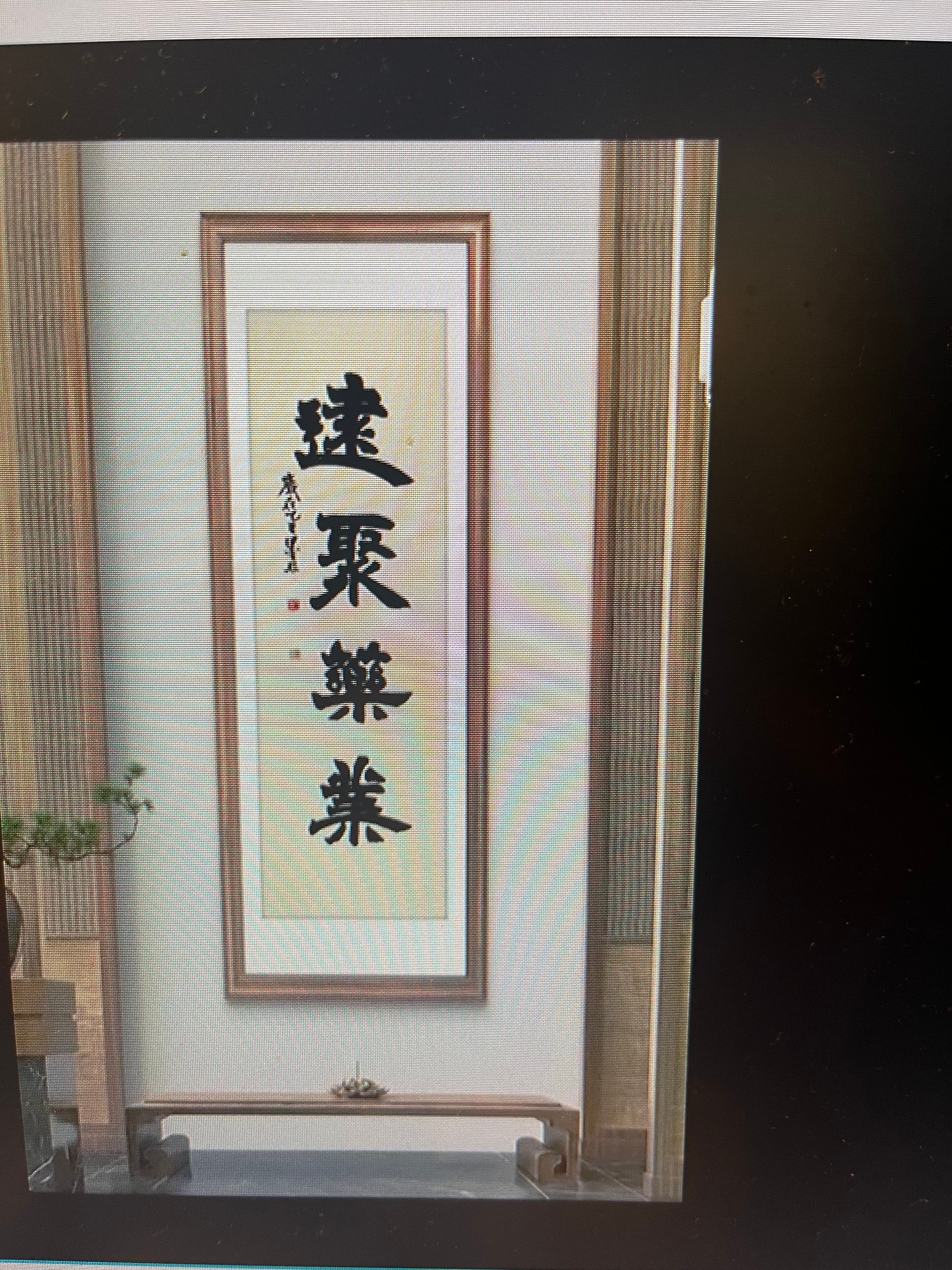
Clerical Roots: Han Dynasty Echoes in Mofei’s Lishu
If Mofei’s running script reaches to the Song dynasty for inspiration, her clerical script (隶书) reaches even further back – to the Han dynasty and its revivalists. Clerical script is the flattened, wide style of writing that predominated in the Han (202 BCE–220 CE), known for its calm authority and flair. In Mofei’s hanging scroll (Image 2), the use of clerical script situates her squarely in a lineage that includes masters like Cai Yong (蔡邕) of the Eastern Han. We can discern in her brushwork the classical clerical “energy” that historians admired in those early exemplars. In fact, Cai Yong’s calligraphy was lauded in his time for “骨气洞达,爽爽有神力” – meaning his strokes possessed a vigorous force and a sublime, spirited powericalligraphy.blogspot.com. Mofei’s clerical characters show this kind of bone and sinew. Each stroke in “结庐在人境” and “无车马喧” is executed with confident pressure, the ink sometimes thinning at the end to reveal textured fibers – a technique known as “flying white” (飞白) that Cai Yong himself pioneeredicalligraphy.blogspot.comicalligraphy.blogspot.com. The horizontal lines are deliberately drawn slow and level, then flicked upward at the tail, producing the decorative “swallowtail” that is a hallmark of Han clerical style. Such details align her work with the refined Eastern Han stelae tradition – one can easily imagine her scroll’s characters carved in stone, resembling the celebrated inscriptions of that era.
At the same time, Mofei’s clerical script is not a rigid copy of ancient models; it carries a lively rhythm that hints at later innovations. Some characters show a subtle cursive tilt or a connected movement between strokes, a quality that recalls the influence of Zhang Zhi (张芝). Zhang Zhi, though a slightly younger contemporary of Cai Yong, is famed as the pioneer of early cursive (the zhāngcǎo style) – essentially a freeing-up of clerical script into something more fluid. His approach began to relax the strict rectilinear forms of clerical, introducing swift, joined strokes and more movement. In Mofei’s clerical pieces, we sense a touch of this freedom. For example, in her rendering of “喧”, the final horizontal merges seamlessly into the downward diagonal, as if the brush couldn’t help but dance a little. This is reminiscent of how clerical script transitioned toward the cursive: as one scholarly description puts it, the round, flowing strokes of earlier scripts evolved into the square, angular clerical to improve speed, and then began to move again toward flow. Mofei’s work bridges these stages. It is grounded in the monumental stability of Han clerical – the gravitas you see in the base line of each character, anchoring it – yet it is enlivened by a personal tempo that belongs to a later, more expressive age.
Which historical lineage does her clerical script align with? We could say Cai Yong’s orthodoxy, for its strength and clarity, combined with a dash of “zhangcao” spontaneity from Zhang Zhi’s legacy. In essence, Mofei opts for a traditionalist clerical style – one that values the “beautiful variety of forms” celebrated in Han clerical – and yet she avoids antiquarian stiffness by allowing small creative variations. Her approach also resonates with the Qing dynasty stele school revivalists (like Deng Shiru and others) who reinterpreted Han scripts with fresh energy. Just as those later masters insisted that personality and aesthetic sensibility must animate even the most ancient script, Mofei infuses her lishu with her own artistic DNA. The result is a clerical script that feels alive, not museum-dead – it balances formality and freedom. In the bold, flattened strokes we read a connection to history; in their lively execution we read an individual present at the tip of the brush.
Ink Aesthetics and Philosophical Depth
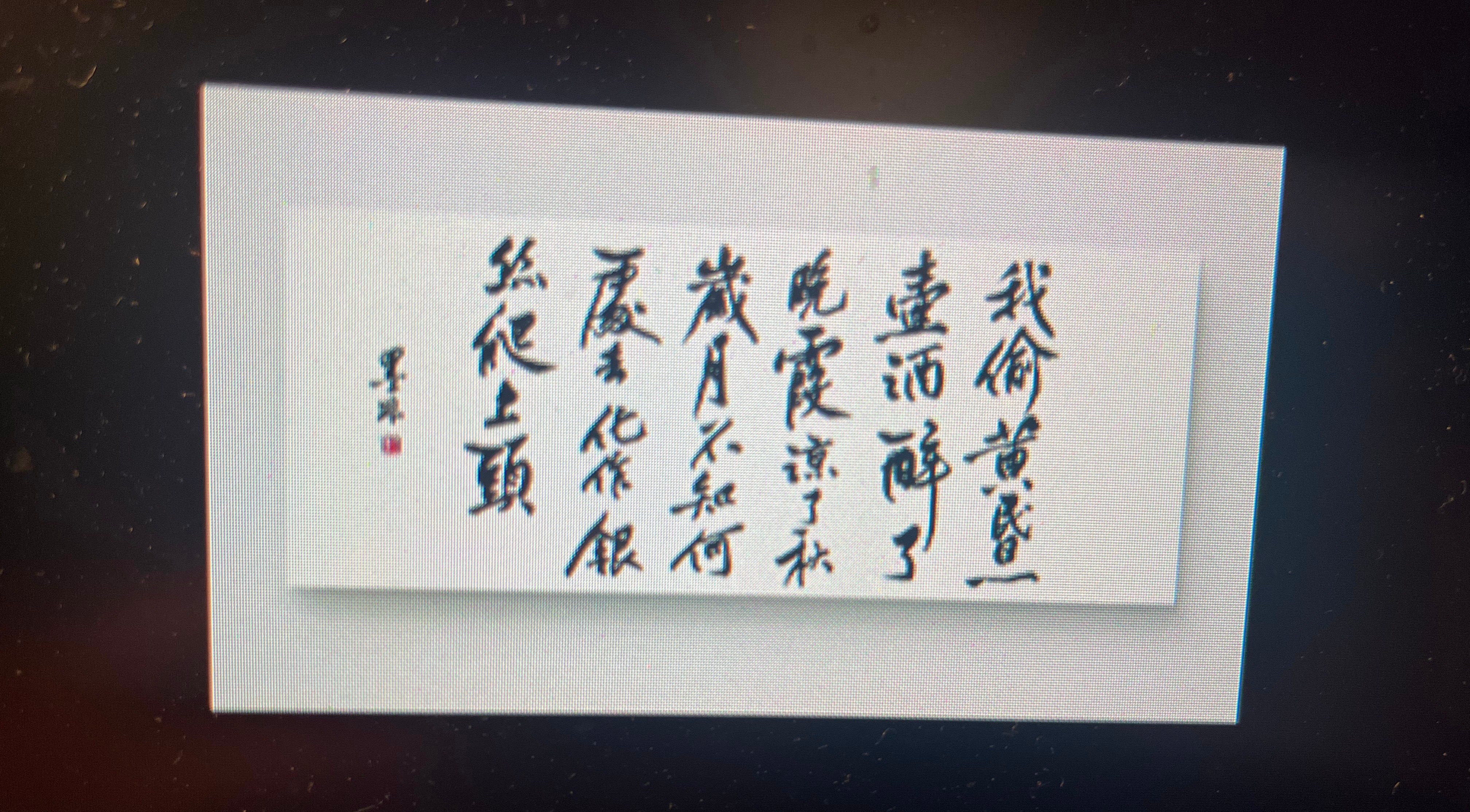
Beyond historical styles, the true allure of Mofei’s calligraphy lies in its aesthetic and philosophical depth. Like the finest calligraphers of old, she treats each character as more than a word – it is a painting in lines, a reflection of inner state. One cannot discuss her work without noting the tactile beauty of her stroke texture and ink control. In her pieces, the ink ranges from lustrous black to ashen gray, often within a single stroke. This deliberate variation (achieved by how she loads and pressures the brush) creates a visual energy: thick, wet strokes anchor the viewer’s eye, while dry, “flying white” streaks within a stroke suggest movement and transience. For instance, in the large character “远” (far) that she writes, the beginning of the long left-falling stroke is solid black, but as it sweeps downward it turns lighter, breaking into textured lines – it is as if the stroke were evaporating, receding into the distance that the word itself denotes. Such textural nuance embodies the meaning in a way mere typed text never could. We are reminded of classical Chinese aesthetic principles where the play of ink (墨) and void (白) carries symbolic weight: the positive inked forms and the negative white space dance in complement. Mofei is attentive to this dance. She allows generous white-space around her characters; the blank paper is not emptiness but rather silence – the pregnant silence after a spoken thought. In the scroll with Tao Yuanming’s quote, the emptiness between the two halves of the line (between “境” and “而”) is like a caesura, a moment of quiet in which the truth of 心远地自偏 (“when the heart is distant, the place itself is secluded”) can sink in. Her compositions never feel congested or monotonous. Instead, they achieve a balance of yin and yang, ink and void, action and pause. This reflects a deeply Chinese philosophy: the idea that what is not painted (or not said) is as important as what is – a concept central to both calligraphy and painting.
Critically, Mofei’s personal expression and contemporary reinterpretation of tradition shine through in her work. Although she works within the venerable conventions – using the orthodox scripts and classical texts – she also quietly subverts and reimagines them. There is, for example, a subtle feminine grace in her strokes that sets her apart from many of the old masters (who were almost all male). Where a historical calligrapher like Yan Zhenqing might exhibit an almost militant firmness, Mofei’s firmness is tempered with lyricism. We sense in her lines a touch of playfulness and martial flair befitting her chosen moniker “Heroine.” It is as though she merges the qualities of a wandering swordswoman and a scholar-poet. The phrase “相忘于江湖” – with its connotations of freedom in the jianghu (the roaming world of knights-errant and outlaws) – is one she writes not only in homage to Zhuangzi, but perhaps also as a statement about her own ethos: a modern artist refusing to be bound by the clamor of societal expectations, choosing the jianghu of art and ink instead. In her reinterpretation of such lines, she both reflects and gently challenges traditional norms. Traditionally, calligraphy was meant to channel the past; Mofei indeed channels it, but also converses with it. Her strokes sometimes exaggerate a classical form just a little – a lengthened tick, an extra lift – giving a wink to the viewer that this is a 21st-century hand at play. Yet she never crosses into gimmickry or mere “non-traditional” exhibitionism. In a cultural moment when some avant-garde calligraphers deliberately distort characters beyond recognition, Mofei remains largely faithful to legibility and classical beauty. In this sense, her work challenges contemporary norms by asserting that innovation can occur from within tradition, by subtle inflection rather than outright rebellion.
The philosophical resonance of her calligraphy is palpable. Chinese calligraphy has long been seen as a physical embodiment of the writer’s cultivation (修养) and mood. The viewer of Mofei’s pieces can infer much about her state of mind: the clarity and balance of her layouts suggest a contemplative, orderly mind; the bold sweeps and occasional whimsical flicks suggest courage and joy. It’s as if each piece is a snapshot of her spirit at the moment of writing. The content of the texts she chooses – detachment from worldly noise, finding quiet in chaos, forgetting constraints and roaming free – all speak to a young artist-philosopher who is negotiating modern life by looking back to ancient wisdom. Through her brush, Mofei engages in a dialogue with poets and sages across time. This imbues her work with a literary depth akin to what one finds in a New Yorker essay meditating on a poem, or a New York Times Book Review drawing connections between past and present. For example, one might compare the ethos of “远离尘嚣” in her calligraphy to Thoreau’s “quiet desperation” observation – yet where Thoreau saw desperation, Mofei’s strokes suggest purposeful tranquility. Her art implicitly asks: Can the modern soul find anchorage in ancient aesthetics? Her own graceful, confident calligraphy responds affirmatively.
Tradition as a Living “River and Lake”
In Heroine Mofei’s calligraphy, we witness a rare and beautiful convergence of past and present, discipline and individuality. Each of the three pieces we examined carries a story. They began as ink on paper, but through her skill and interpretation, they become more than the sum of their strokes: they are invitations to introspection, bridges to cultural memory, and testaments to personal passion. Mofei draws from the well of history – whether invoking Huang Tingjian’s running script mastery or the Han clerical dignity of Cai Yong – and yet she writes with her own hand, unmistakably. In doing so, she reaffirms that these ancient calligraphic traditions are not relics under glass; they are living arts, flowing like the 江湖 rivers and lakes of lore. Just as her ink travels across the page with unforced grace, Mofei’s artistic journey travels between eras and influences with a natural, unforced authenticity.
Readers and viewers encountering her work might first be struck by the visual beauty – the bold contrast of black on white, the dance of lines – but they soon discover the poetic and philosophical layers embedded therein. In a world awash with digital text and instantaneous communication, Mofei’s hand-crafted characters insist on slow reading and contemplation. They carry the weight of tradition but also the lightness of the artist’s own being. Like a New Yorker profile of an emerging artist or a NYT Book Review analysis of a rediscovered classic, our study of Mofei’s calligraphy reveals a narrative: the resurgence of classical Chinese aesthetics in the modern age, guided by a young woman with an old soul and a free spirit.
In the end, the most striking aspect of Heroine Mofei’s calligraphy is perhaps its sincerity. The strokes do not lie – they pulse with the sincerity of someone who loves the art. Each piece is at once a display of technical mastery and a candid journal entry of the heart. Standing before her work, one senses what the Tang dynasty calligrapher Sun Guoting described as the highest aim of calligraphy: to see the shape of one’s mind and spirit in the ink. Mofei achieves this. Her calligraphy invites us to slow down and listen to the quiet voice of culture speaking through brush and ink. It reminds us that in our own hectic lives, we too might find moments to “build a hut in the world with no clamor of carriages,” to “forget each other in the rivers and lakes” – to find, in art and contemplation, a refuge 远离尘嚣, far from the madding crowd. Such is the timeless cultural significance of her work: it is not only an artistic performance but also a gentle call to introspection, a bridge between the ancient ethos and the modern soul, penned by a heroine roaming the boundless jianghu of ink.
Sources:
Tao Yuanming’s “In Wine” (No. 5), original text and translationmacaudata.momacaudata.mo.
Zen Art Gallery Blog – overview of clerical script characteristics and running script characteristics.
Huang Tingjian’s calligraphy style analysis – Song dynamics and structurewapbaike.baidu.com.
Historical evaluation of Cai Yong’s clerical script – “vigorous and with mysterious power”icalligraphy.blogspot.com.