
A Letter as a Score
— On the Rhythm and Layout of Gongshi Tie

Ren Jingjing (任晶晶)
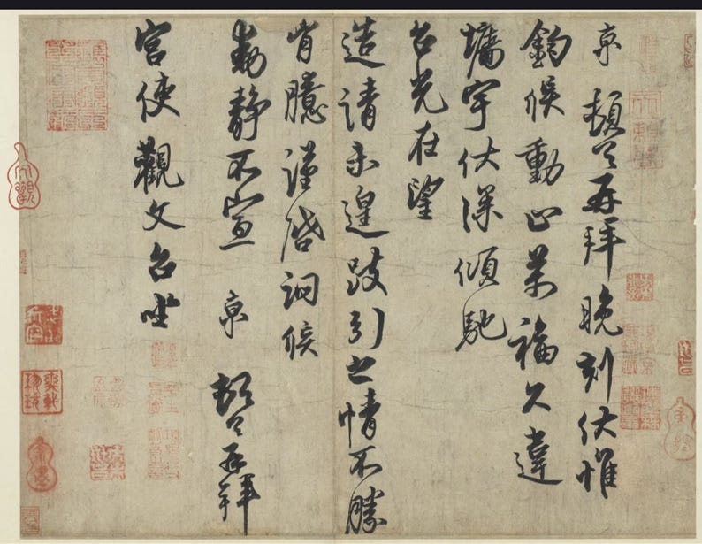
Gongshi Tie (《宫使帖》) is a short piece of running-script correspondence on paper, written in vertical columns. It does not contain many characters, yet it feels complete. The text is essentially a greeting to a palace emissary: asking after his illness and his household. The subject is ordinary, which makes it ideal ground for running script. It is not a solemn stele title, nor a wild-cursive tour de force, but everyday language with a slight ripple of feeling.
Seen as a whole, the first impression is “calm yet lively.” The movement of the brush follows the path of semi-cursive from the upper right down toward the lower left, unrolling line by line. There is no sudden halt, no awkward jolt, yet the writing never turns soft or slack. The ink tone is even but not monotonous: there are full, dark strokes, and there are places where the brush slightly skims the paper and leaves a hint of dry texture. The viewer senses that the tip of the brush truly rose and fell on the paper; this is not a polished, over-managed performance. Judged purely by its visual effect, Gongshi Tie deserves to be called “flowing and graceful.” The point is that its quality is not the kind that startles at first glance. The work hides its craft in the details.
Under Emperor Huizong (宋徽宗), politics slid toward decline while the arts flourished. Huizong himself painted and wrote; refinement and elegance were prized at court. Cai Jing (蔡京) wrote Gongshi Tie in this world. In the histories he is a notorious grand councillor, yet he left behind a running-script letter that has been copied again and again and fetches high prices whenever it appears at auction. The piece works like a mirror, reflecting the complicated relation between a man’s character and his calligraphy.
Brushwork Between “Charm” and “Composure”
Critics of Cai Jing’s hand often use words such as “charming,” “vigorous,” “unrestrained,” and “composed.” All of these can be matched to evidence in Gongshi Tie, but the brush must be taken apart to see how.
Most of the strokes are written with the brush upright, the core of the tip running steadily down the middle, so the lines are full and never feeble. In several “walking” radicals, the long downward strokes bend slightly and the verticals draw inward a little—like in the character for “envoy” (使)—which gives them the feeling of a figure setting its feet firmly and straightening its back.
At the same time, Cai Jing does not cling rigidly to the center-stroke method. At many quick turns he deliberately lets the brush tilt. The endings of strokes carry faint “flying white,” the tip slanting and the ink lightening as the stroke flicks away. The upright brush provides the bone; the slanted touch supplies the flesh. The two together create a temperament that is at once settled and lively.
Within each character, the alternation of heavy and light pressure is clear; the rhythm is strong. Most strokes begin with a small, firm touch, then the main horizontals and verticals are pressed down with greater force, and finally, at the turns, the pressure eases. Every character follows a rhythm of “opening—crest—return.” The rhythm is not exaggerated, and it lacks the drastic flips and turns of Mi Fu (米芾); it is as natural as breathing, one inhalation and one exhalation, linking the whole piece. As the eye moves through it, there is a steady pulse, neither hurried nor dragging. This is where the writing feels “unrestrained yet composed.”
Control of ink is equally steady. The ink is handled conservatively, without reaching for risk. Darker areas never clog; paler strokes never dry to the point of brittleness. There is no deliberate pursuit of great splashes of “flying white,” and none of those shocking broken strokes that seem about to snap. In modern terms, the risk level sits “above the middle”: pleasing and varied, but never reckless. This can also be read as a reflection of Cai Jing’s temperament and station. As a chief councillor he could not be as willfully wild as Mi Fu. As a leading figure on the Huizong-era calligraphy scene, he had to offer a standard of beauty that others could emulate. So his brush tends toward “pleasing,” “balanced,” and “teachable,” instead of toward “dangerous,” “austere,” or “solitary.” The strength lies in its steadiness, elegance, and accessibility. The weakness lies in the same place: at times the writing is almost too smooth, lacking the raw edge of true ferocity.
Structure: Measure Within Broken Convention
Readers have pointed out some striking structural moves in Gongshi Tie: characters such as “sit” (坐) and “wait” (候) lean with the right side higher than the left; “bow,” “request,” and “lead” (拜、请、引) are opened wide to the left and right; “palace” and “look up” (宫、望) are written big at the top and small at the bottom. These do show Cai Jing’s care in composing the forms.
Overall the characters tend toward a “slender” profile and seek openness. Song-dynasty running script in general favors stretching the verticals to create a taller shape. Gongshi Tie shares this trait. Many vertical strokes are consciously lengthened, while the horizontals are slightly restrained. The space between lines opens naturally, and the sheet feels airy. Take the character “still” (静): the upper “blue/green” component is written fine and long; the lower part narrows horizontally. The entire form stands like a stalk of bamboo, “still yet not stifled.”
Local departures from the norm are used to bring in emotion. In characters such as “sit” and “wait,” the right component stands markedly higher than the left, forming a left-low, right-high tilt. This tilt nudges the line of movement slightly upward to the left, like an eyebrow lifting unconsciously in speech, adding a trace of emotional rise. In “bow,” “request,” and “lead,” the left and right parts are pulled apart so that a clear gap opens between them. This not only lets the lines breathe; it also heightens the sense of gesture—“bowing, requesting, leading” are all about bodily action, and these characters seem to stretch out their arms in keeping with their meaning.
For “palace” and “look up,” the upper sections are large and heavy while the lower parts are tightened. Top-heavy forms always risk visual imbalance, but Cai Jing uses the downward strokes and sweeping tails of the bottom halves to pull the center of gravity back down. The result is a slight lean without tipping over, suggesting a posture of craning or reaching out. In a letter dealing with courtly contacts, this visual “leaning toward” feels apt.
Changes in density within and between characters are where the rhythm of “still—swift—feeling—tilt” hides. Across the scroll, spacing between characters and lines is handled with care. Some stretches are compact, like a string of short phrases just before a pause; others suddenly loosen, leaving more blank paper. The tempo of “still—swift—feeling—tilt” is produced through this play of structure and spacing. In longer phrases midway through the text, characters link closely together, almost merging toward cursive, and the strokes pick up speed. At points of punctuation or polite formula, the spacing widens and the strokes slow down. If one borrows an image from music, this letter is like a simple melody with clear beats, ornamented here and there with small grace notes so that calmness holds a flicker of movement.
Structurally, Cai Jing clearly knows the bones of Tang-style regular script and has absorbed the slanting energy of the “Two Wangs.” He is unafraid to break the equilibrium of standard script in local spots, yet he always restores stability with the next stroke. “Danger” and “safety” coexist within the same character. This measure in breaking the rules is one of his strengths.
Layout: How a Letter Breathes
For a sheet of running-script correspondence, layout is mostly about the movement of the lines. From the first column to the last, the distance between lines in Gongshi Tie stays relatively even, but it is not mechanically uniform.
The columns lean slightly, giving the whole an overall slant. Each column tips gently to the right; the heads of characters lift a bit toward the upper right, and the ends draw back toward the lower left. Stacked together, the lines form a plane that slopes from upper right to lower left. This is not so much imbalance as it is “momentum.” It pulls the viewer’s gaze gradually downward, like a voice that simply continues along its train of thought.
At the ends of columns, blank space gives the emotion a place to land. Most terminal characters finish cleanly, without long trailing strokes. Between the last character and the paper’s edge there is reserve; nothing is crammed to the margin. Each line ends with a small zone of emptiness, like the pause after a sentence. In a letter, this kind of spacing signals a sense of measure: the writer knows where to stop and avoids nagging. For a grand councillor addressing a palace emissary, such self-restraint in tone fits his station.
The surviving images show several collector’s seals at the lower left and others on the right. Cai Jing himself had no way of knowing who would stamp his work later, so their placement reflects later aesthetic choices. Even so, the original leaves enough open corners to receive these seals without crowding, which suggests a generous treatment of margins from the start. He did not drive his characters all the way to the paper’s edge. This wide edging carries a kind of “aristocratic” ease: space is not fought over but held.
In short, the layout of Gongshi Tie does not chase spectacular design. It seeks a balance of calm movement. The smoothness comes from the stable flow of columns; the musical quality comes from tiny rises and dips in the spacing that are easy to overlook at first.
Compared with Su, Huang, Mi, and Cai Xiang: Different Paths in the Same Age
Song-dynasty running script is often summed up by a four-part formula: “Su, Huang, Mi, Cai.” On which “Cai” this points to—Cai Xiang (蔡襄) or Cai Jing—scholars disagree. Some research suggests that the original refers to Cai Jing and that only later, when his political reputation turned poisonous, was his place quietly given to Cai Xiang. Whatever the case, Gongshi Tie becomes clearer when set beside Su Shi (苏轼), Huang Tingjian (黄庭坚), Mi Fu, and Cai Xiang.
Against Su Shi, Cai Jing has less expansiveness and more care. The great charm of Su’s running script lies in its openness and play. Works such as Cold Food Observance (Hanshi Tie, 《寒食帖》) are not always perfectly formed, yet they have a broad, relaxed spirit and the sense of “hills and valleys in the breast.” In contrast, Gongshi Tie is markedly more contained. Every character seems carefully groomed; strokes are polished, and there are almost no truly casual touches. This difference mirrors two types of life. Su Shi, beaten again and again by politics, allows himself to loosen in his calligraphy. Cai Jing, at the pinnacle of power, manages his image with care; his writing also leans toward meticulous grooming. Artistically, Gongshi Tie lacks the heedless generosity of Su’s hand—that is one of its shortcomings.
Against Huang Tingjian, Cai Jing has less angular bone and more roundness. Huang’s running-cursive is famed for its “thin hardness.” His characters tilt strongly, horizontals long and verticals short, like clumps of tough bamboo. Gongshi Tie also tilts at times, but as a whole it remains rounded. Its verticals are relatively long; the impression is of a well-fed body with a firm waist, not of stark ribs. Huang’s danger and intensity require several viewings to appreciate. Cai’s appeal lies in immediate agreeableness. One leans toward “bone,” the other toward “flesh.” For today’s general taste, Gongshi Tie is easier to accept. For calligraphers, Huang’s fierce “sinew” may offer more to chew on.
Against Mi Fu, Cai Jing gives up madness for order. Mi is the wildest of the Song masters. His strokes jump in thickness and speed, as if dancing on the paper. Beside him, Gongshi Tie shows a strong sense of order. There are flying strokes, yet the overall tempo never spins out of control. Many scholars note Mi Fu’s influence on Cai Jing, especially in the liveliness of his brush and the flecks of flying white at his turns. The key difference lies in degree. Mi is willing to write at the edge of danger; Cai ventures no further than “a touch of danger within safety.” This gap may be one of courage; it may also be the pressure of rank. The result is that Gongshi Tie fits much better as a model for official taste and is unlikely ever to become a truly rebellious art.
Against Cai Xiang, the two men of the same surname follow different roads. Cai Xiang’s celebrated works, such as Self-Written Poems (Zishu Shijuan, 《自书诗卷》) and Chengxintang Modelbook (Chengxintang Tie, 《澄心堂帖》), are known for their warmth, dignity, and scholarly air. Compared with these, Gongshi Tie carries more worldly splendor. One embodies the bearing of a Confucian official; the other displays the posture of a powerful minister. Cai Xiang’s structures largely keep within Tang-style rules and depend on subtle internal variation. Cai Jing is more willing to tilt and stretch his forms. Cai Xiang seeks elegance within the bounds of propriety; Cai Jing seeks posture along the edge of those bounds. Put moral judgment aside for a moment, and the two can be seen as complementary: the elder provides a baseline, the younger offers possibilities for extending outward.
Lessons and Limits for Today’s “Exhibition Style”
In contemporary calligraphy exhibitions one often sees a standardized “exhibition style”: oversized characters, sleek lines, balanced structures, orderly layouts. From afar such scrolls look imposing; up close they often lack a distinct voice. Gongshi Tie can serve as a mirror for this type.
Technically, its brushwork is solid. Pressure is clear, turns are well handled. These are fundamentals any serious student must master. Many modern works feel floaty or weak because they lack this old-fashioned control where the upright stroke is primary and the slanted touch acts as seasoning. In this respect, Gongshi Tie offers concrete models in stroke control, structural variation, and page design—the balance of steadiness and movement.
Its handling of density on the page is also worth learning. Contemporary exhibition pieces often “fill” the sheet from corner to corner. The viewer’s first impression is only of abundance; there is no rise and fall. Gongshi Tie reminds us that good work needs room to breathe. The letter feels approachable because it preserves the natural cadence of writing to someone, instead of treating every character as a stand-alone “art object” to be carved. Exhibition calligraphy today, even when written at large scale, could benefit from this sense of spoken rhythm.
The deepest flaw in Cai Jing’s hand lies in its over-ripeness. Everything is arranged too well; there is almost no chance of failure, and thus little possibility for surprise. On the level of taste, this forces a question: has the pursuit of visual smoothness and splendor gone too far, to the point of thinning out texture and courage? Visually, Gongshi Tie carries a certain luxurious air. In the court of Huizong that was natural. Transplanted directly into the present, the same air easily turns gaudy. If modern calligraphers imitate only this “safety,” they will produce work that is “beautiful but hollow.” Commercial exhibitions in particular tend to amplify this kind of opulent taste, squeezing out room for plainness and restraint.
History’s judgment on Cai Jing as a person is harsh. Later generations discussing his calligraphy can hardly avoid the phrase “the writing reflects the man.” Calligraphy is not a decorative object that floats free of history. How a writer positions himself in reality will leave marks in his work. There is no need to strike Cai Jing down with a single blow of “bad man, bad writing.” Nor is there any need to pull calligraphy and character completely apart. The tension between them is exactly what makes Gongshi Tie worth talking about today.
The piece is, in this sense, a “traitor’s work.” It hangs in the study as a refined art object, yet its author is infamous in politics, and the work itself reaches a high technical and formal level. The very contrast makes it more instructive than many prestigious relics.
From a purely calligraphic standpoint, Gongshi Tie has firm brushwork, supple structure, and even, breathing layout. It stands as a representative link in the chain of Song running script. It carries forward the tradition of the “Two Wangs” and Tang-style regular script, absorbs experience from Su, Huang, and Mi, and performs well by two standards: “teachable” and “pleasing to the eye.” From a critical angle, it also exposes certain problems in official Song taste: the preference for “charming posture,” the pursuit of safety, the fascination with polish. These traits have traveled across centuries and still shape today’s exhibition style.
Judged solely as script, the work should not be rejected simply because its maker was a villain. Yet another fact cannot be ignored: when craft reaches a high pitch while inner values and public ethics drift far away, an unspeakable hollowness tends to seep into the work. Something similar can be seen in much contemporary exhibition calligraphy: the form is impeccable, the spirit is empty. This is not only a matter of strokes. It is a matter of how the maker faces the world.